

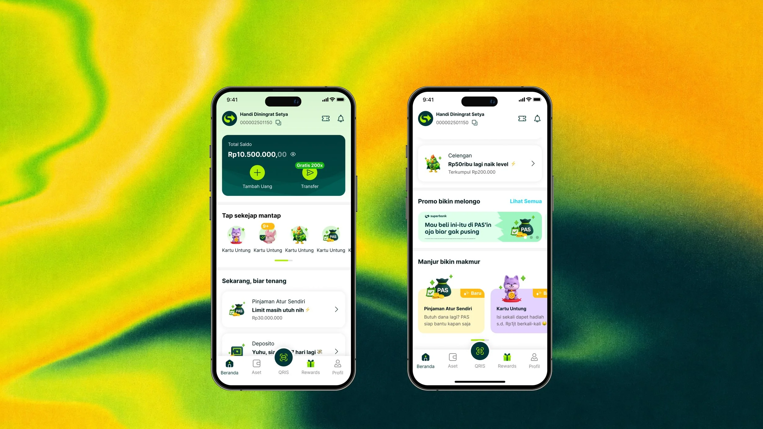
Redesigning Superbank’s home platform space and governance enabling users to personalize and access products on their daily basis that led to increase in 40% Click Through Rate.
Superbank has obtained almost 6 million customers per April 2026 as the only digibank that offers seamless transactions in the Grab ecosystem and offers a 7% interest in every deposit. Every single customers will always see these products in a space where business and product teamed up to get exposure which is the homescreen. The homescreen is never perfect. It's a battleground. The one place where every product wants the highest exposure, and every user just wants to get things done. This is the story of how I designed governance for that battleground and how a rejected idea about customization became the thing that made it work.
Problem
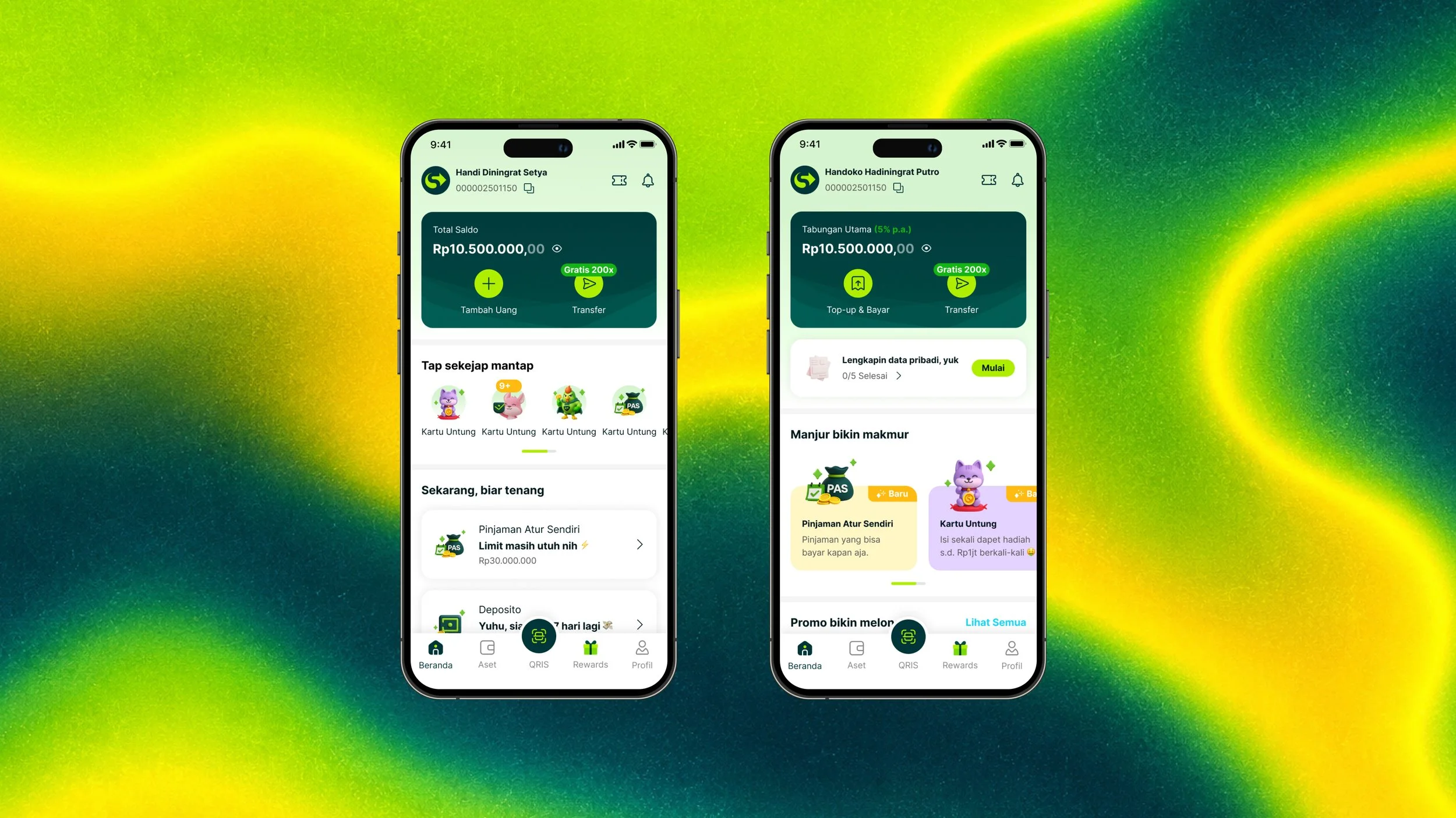
Problem of product: Users couldn't find what they came for. Underneath the surface, the homescreen was quietly failing the people it was built for. The priority of the menus had become obscure and unclear where users couldn't reliably access the products they wanted.
Problem of business: Everyone wanted the top shelf. The tension surfaced during product strategy, at the earliest planning stage for our upcoming releases.
Challenge
A homescreen has to cater for product needs, business needs and customer need. They need to believe they own it: business teams competing for placement, and users who simply want their bank to make sense. Solve for one and you break the other. There was no existing framework to decide what deserves space, where, and why the placement was decided by whoever argued loudest.
The MVP that we established as an area of focus are:
Phase 1
Homescreen anatomy and fold structure
Homescreen touchpoint experience
Homescreen governance and guide
Project Role
1. Product Designer: Focusing on end to end experience
2. Designed the first concept for the moonshot app
Output & Impact
First launch improvement: Phase 1 by the numbers
+40% click-through rate since the new Shortcut section was introduced.
+20% daily logins, with users engaging more now that products are visible.
Drop-off fell from 22.57% to 10% — cut by more than half, with far fewer users logging in only to bounce.
Background
Superbank's homescreen is the forefront of the digibank — the first impression users judge us by, and the hub where every daily banking need begins. Our three revenue cornerstones all live here: savings and deposits, payments, and lending.
When users want to borrow, they need to see the entry point. When they want to check their savings, they head to the asset section and the main card for their total balance. When they want to pay, they reach for the QRIS shortcut to scan, or tap the transfer button.
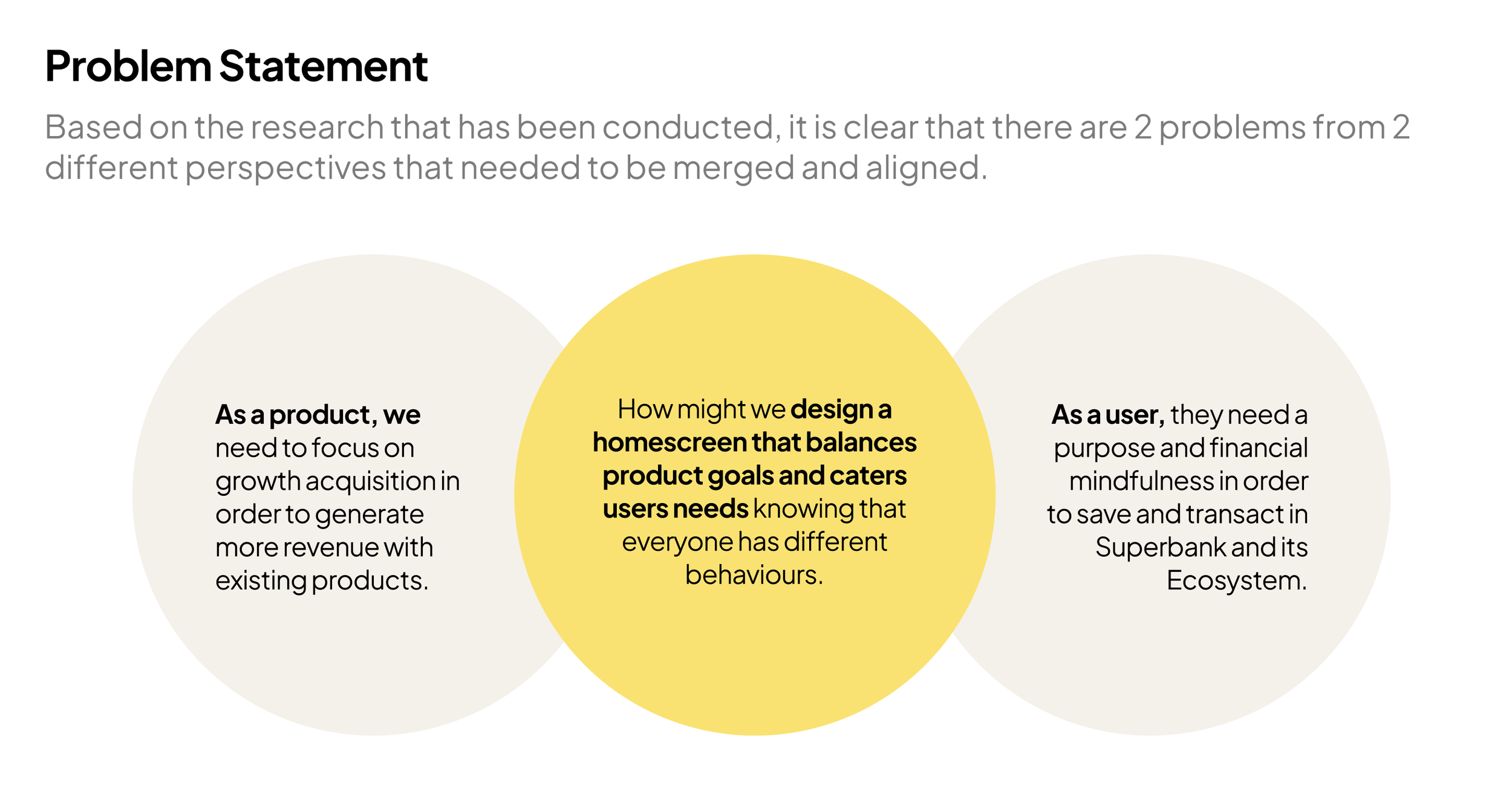
In short, the homescreen is where the whole bank happens and as our products kept evolving, it had to evolve with them. There were 2 problems that we are overseeing and needed to solve.
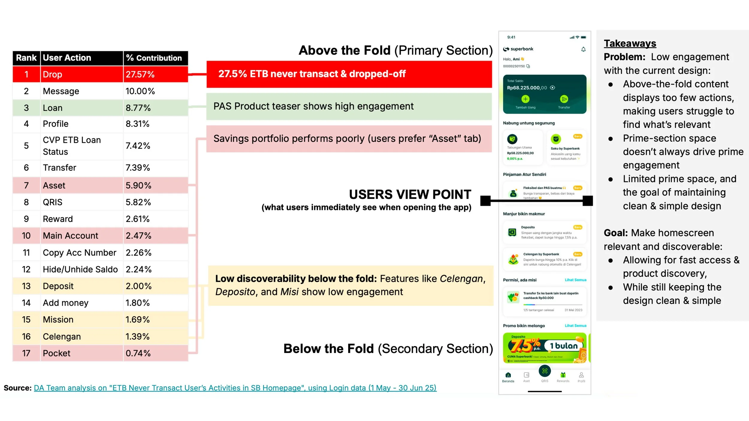
Problem of product: users couldn't find what they came for
Beneath the surface, the homescreen was quietly failing the people it was built for. Menu priority had become obscure and unclear, and users couldn't reliably reach the products they actually wanted. Our data told the story plainly:
22.57% of users dropped off right after logging in — they checked one thing that mattered to them, then left without doing anything else.
Message and profile menus pulled 8–10% CTR — utility items outperforming the products the bank runs on.
Among our core revenue products, only Loans cleared 8.77%. Everything else sat at 7% or below.
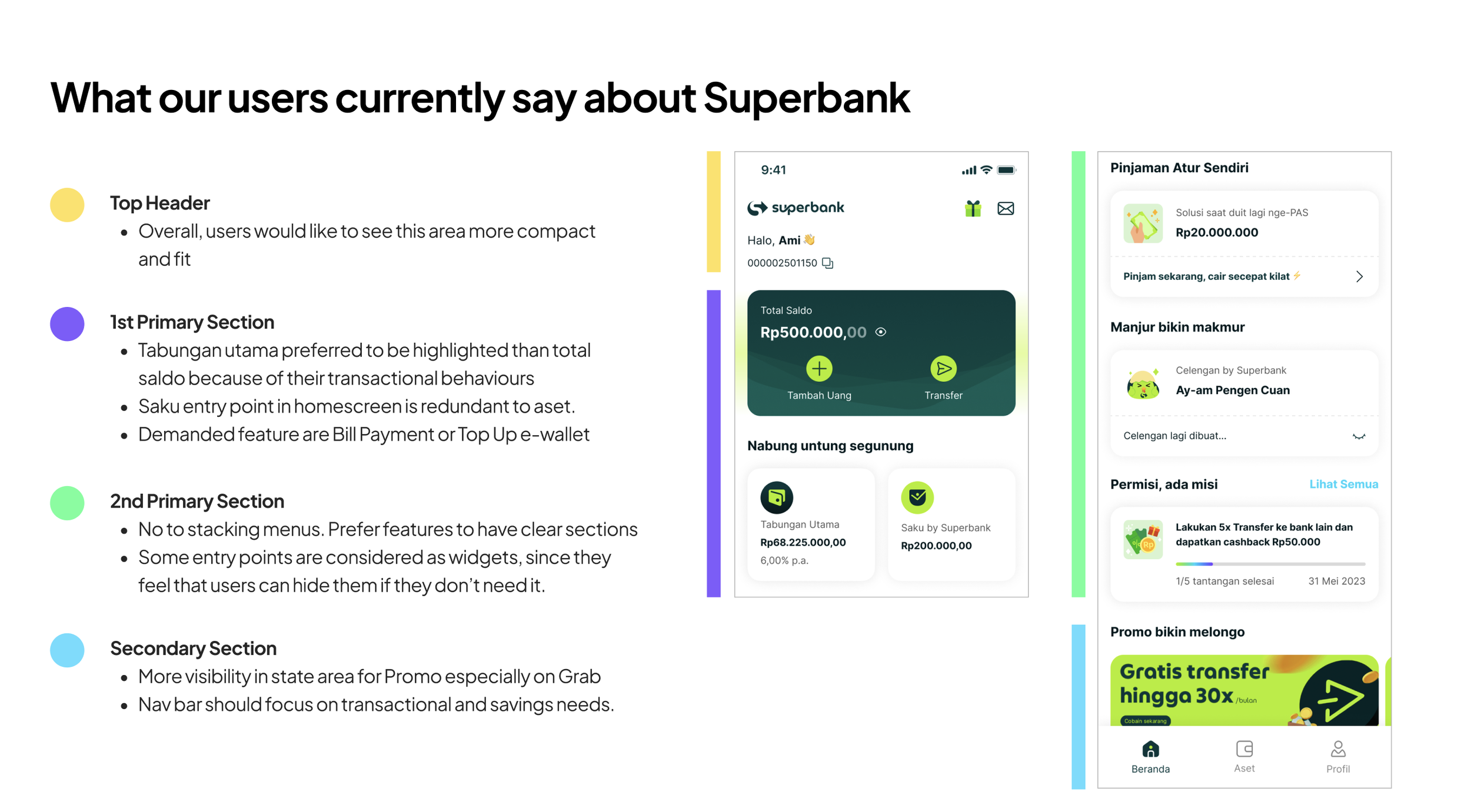
Problem of business: everyone wanted the top shelf
The tension surfaced during product strategy, at the earliest stage of planning our upcoming releases. One PM raised the question first: "Are we going to stack everything up here on the homescreen? My product just got pushed to the bottom now it has no visibility."
This issue affects the users in a way that what business strategy wanting to implement, somehow it doesnt reflect to what users needed. Users have a lot of to give us feedback where each sections they disected and highlighted that each components and sections did not play the right role and created confusion for users whom use on a daily basis.
The battleground between product and business where everyone is trying to get the real estate because everyone wants maximum exposure and higher visibility drives higher clicks and engagement.
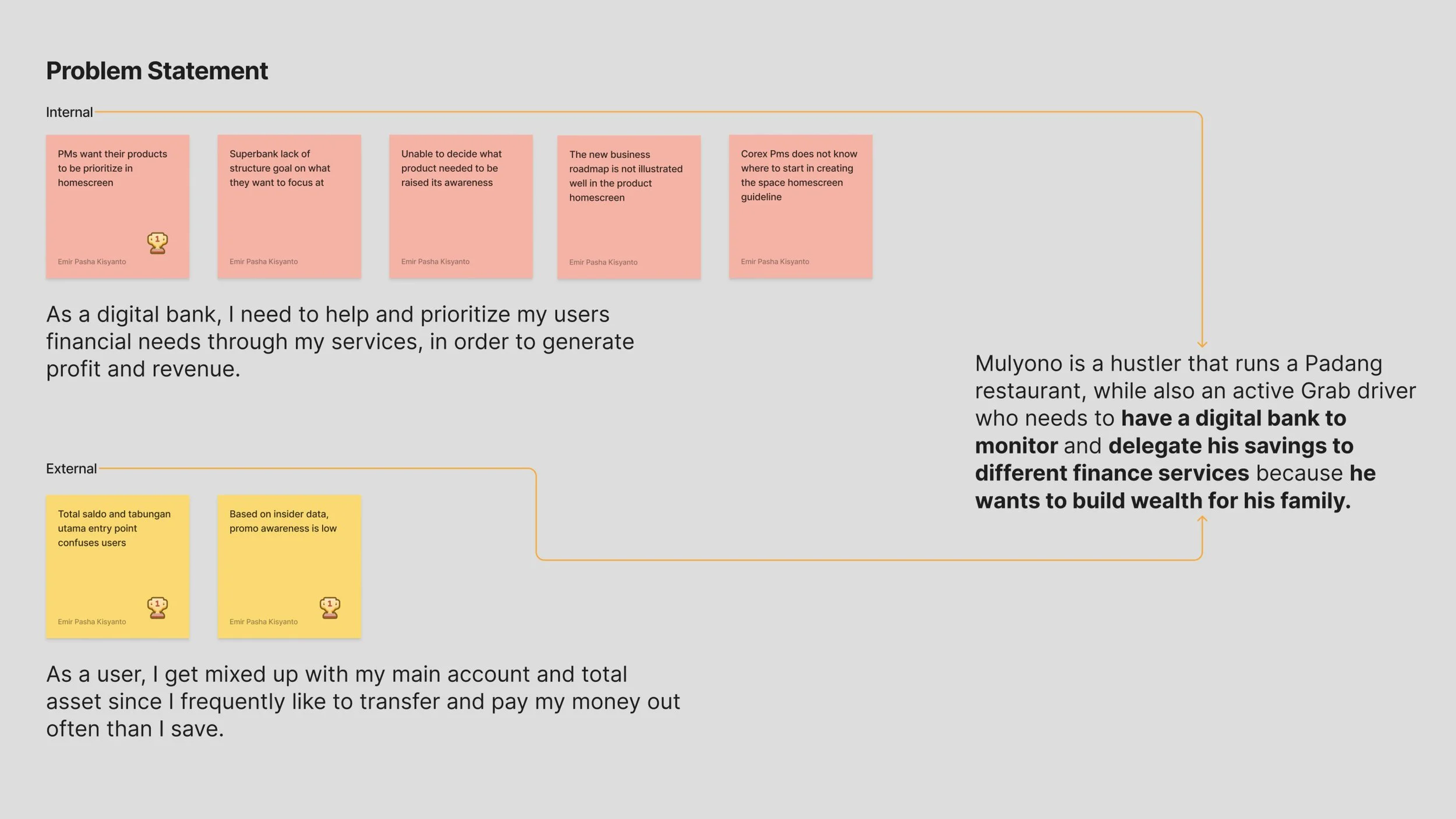
Objective: Governance for the business, Clarity for the user
My goal was twofold, and both halves had to hold:
Design the right governance for the homescreen: A system where business and product teams get equal, principled access to space, so placement decisions come from rules instead of arguments.
Keep the homescreen enjoyable and easy to navigate: Whatever the governance is decided for users, the experience stayed effortless, even delightful, to use.
Making sure I was solving the right problem
Before touching a single screen, I needed evidence that this was a real user problem. I started by studying our current user market and pulling performance data, then mapped the homescreen's anatomy — analyzing the above-the-fold and below-the-fold sections to see exactly what users were being served, and in what order.
Two market truths shaped everything that followed:
Indonesians own a lot of banking apps, each with a designated purpose. Users already know what they want from each bank before they open it.
Superbank's designated purpose today is Grab ecosystem transactions and special promos. That's the job users hire us for — and the homescreen wasn't built around it.
When the data team shared the performance numbers above, the two problems snapped into one picture: the PMs' anxiety over product exposure and users' inability to find products were the same problem. The hierarchy was unclear to everyone, inside the building and out.
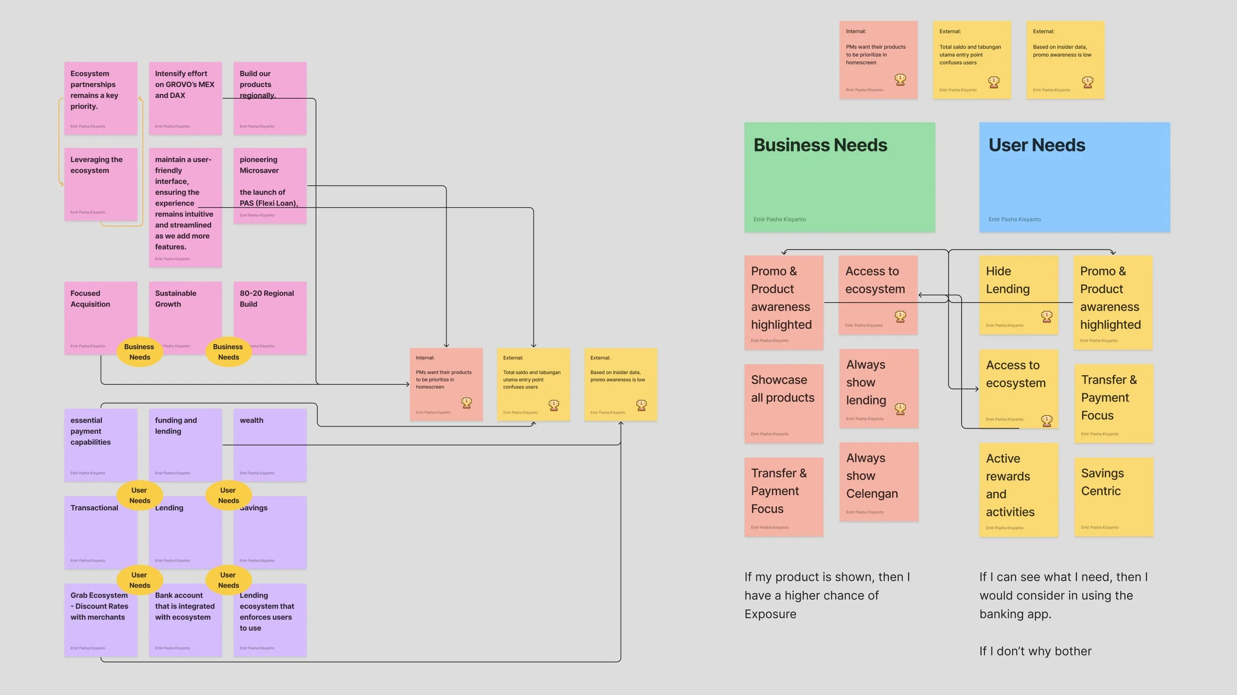
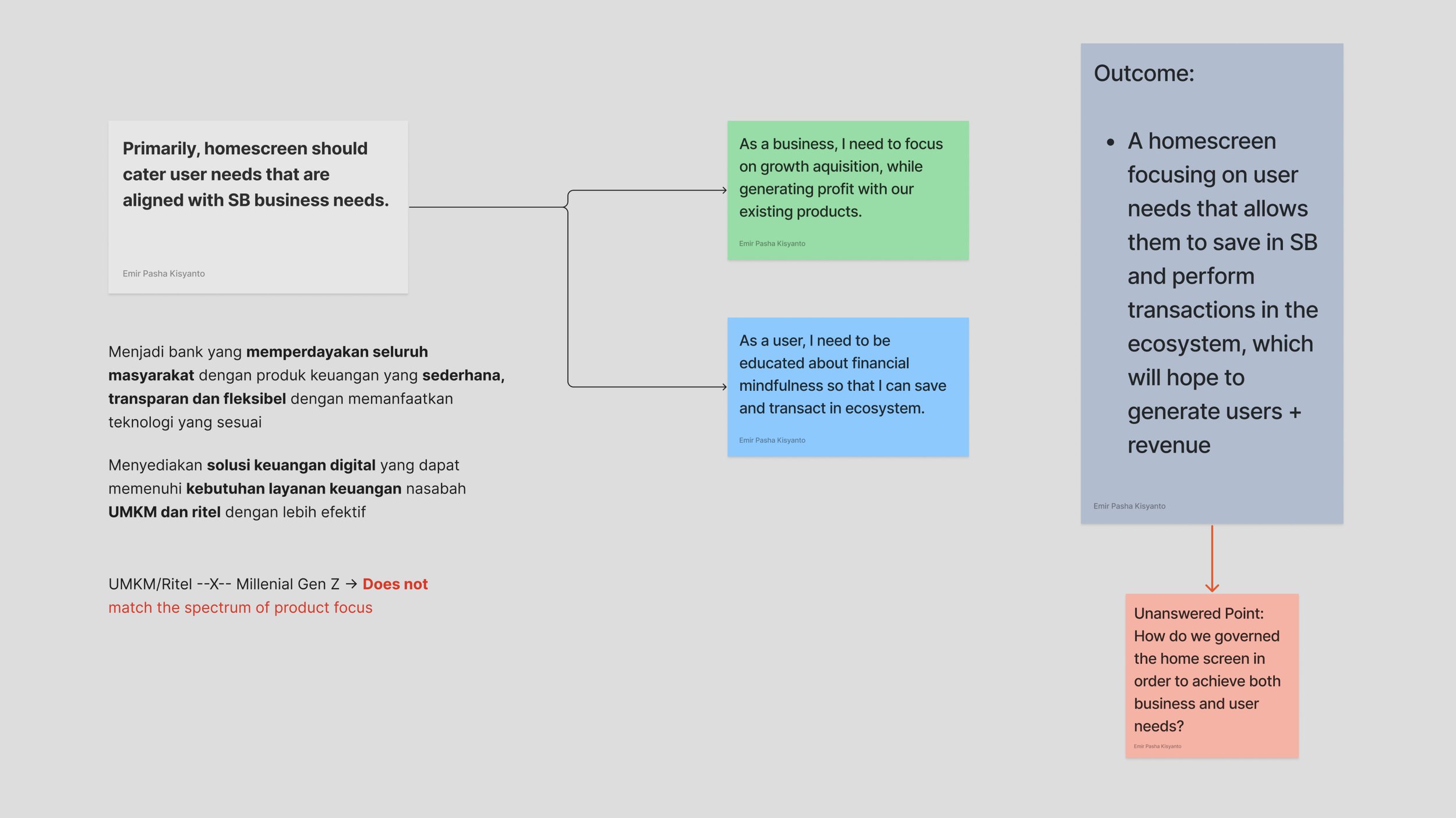
The exploration we done kept leading to the approach of personalization
I ran an ideation session with my team, testing the problem against Superbank's values and our positioning for both the bank and its users. We kept landing in the same place: the homescreen should aim for personalization. At the end of the day, users already know what they want from their bank. Some of the people we researched said it outright — it would be nice if Superbank only showed me what I actually use.
Meanwhile, most digital banks in Indonesia run a templated layout — the layout they believe users should want. That gap was our opportunity to stand out: Superbank could become the first digital bank with an automation engine that identifies each user's needs and serves them the right products.
From there, we made the founding decision of the project: data would be the foundation of the governance design. Business and product would get a guide to follow, built entirely from what users were actually looking for.
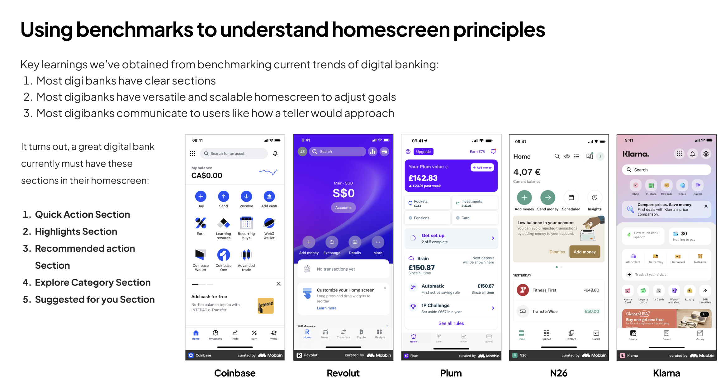
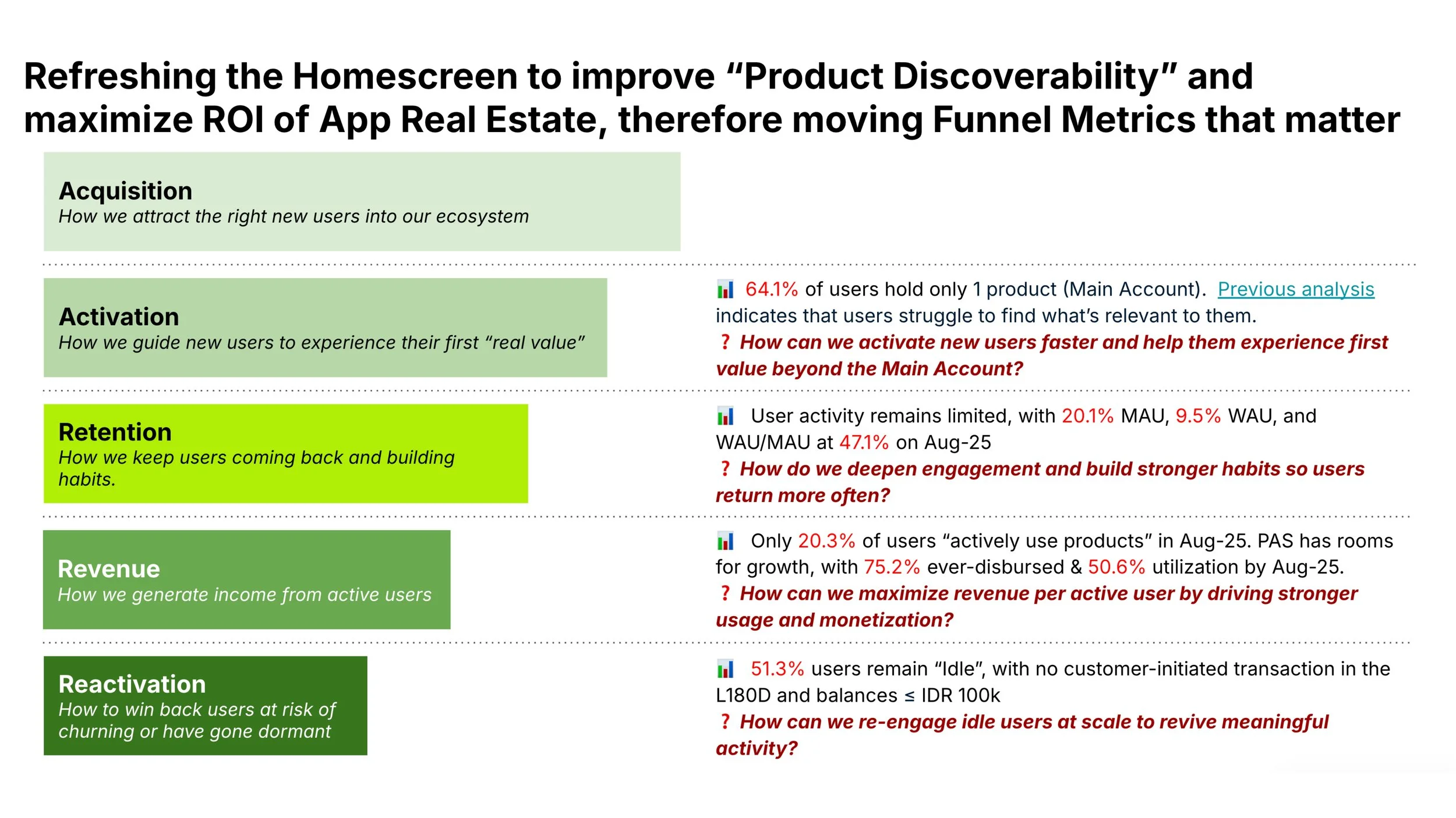
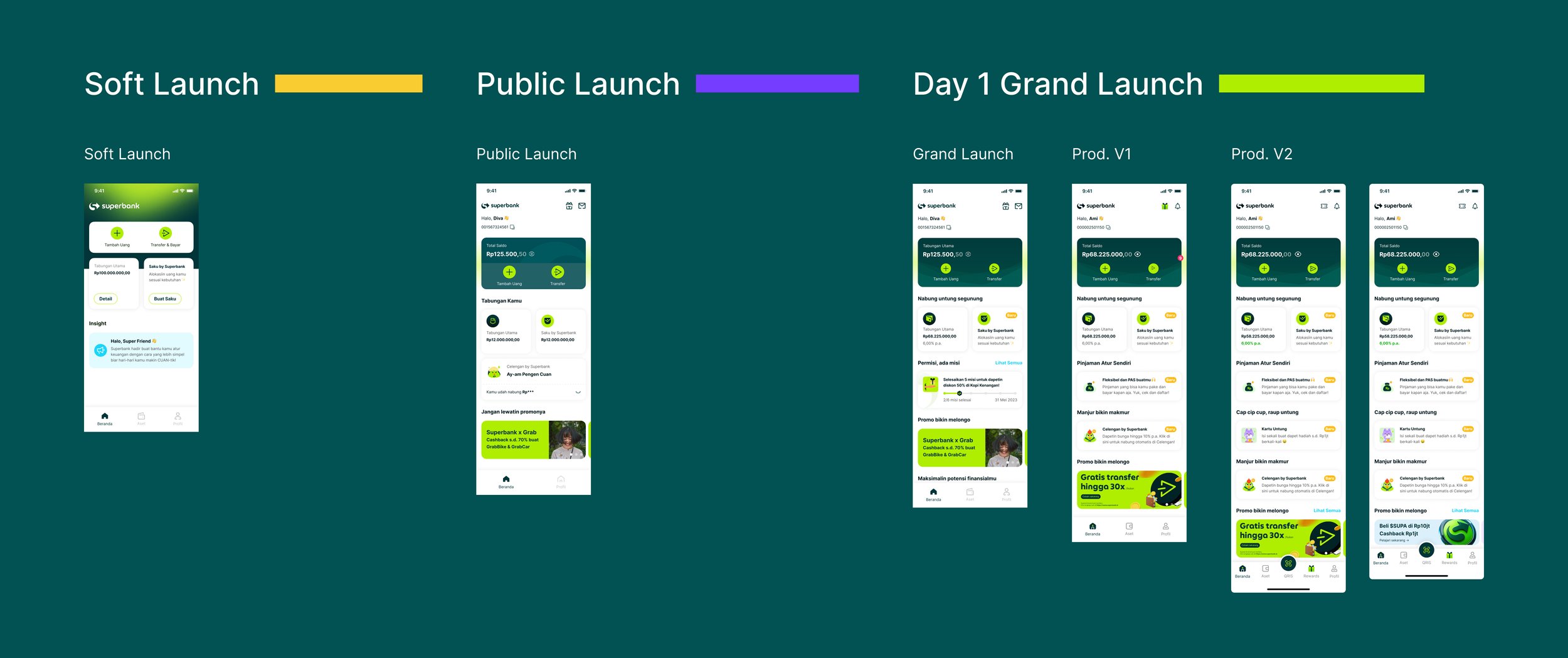
We prepared the roadmap plan for our homescreen design to ensure consistent check and review
Design explorations: countless trials, approvals, and rejections
This is the part of the journey I now count as a personal favorite, precisely because of how much I had to endure and own. The explorations went through round after round of stakeholder rejection, always on the same grounds: the direction hadn't yet earned its supporting data, or proven the core value of the improvement. I explored three main variations:
A dedicated Discovery page in the navigation bar — move product browsing out of the homescreen entirely.
A dedicated menu button in the above-the-fold section — one tap to reach everything.
A scrollable product section — surface the full product list without forcing a long scroll.
To move fast through this many iterations, I brought AI tools into my workflow: ChatGPT to build the framework and guidance for each direction, then Figma Make to design the variation options and run a single working prototype to confirm each idea actually functioned. It got ideas out of my head and into something testable quickly, so I could grasp, check, and discard directions at the speed the project demanded.
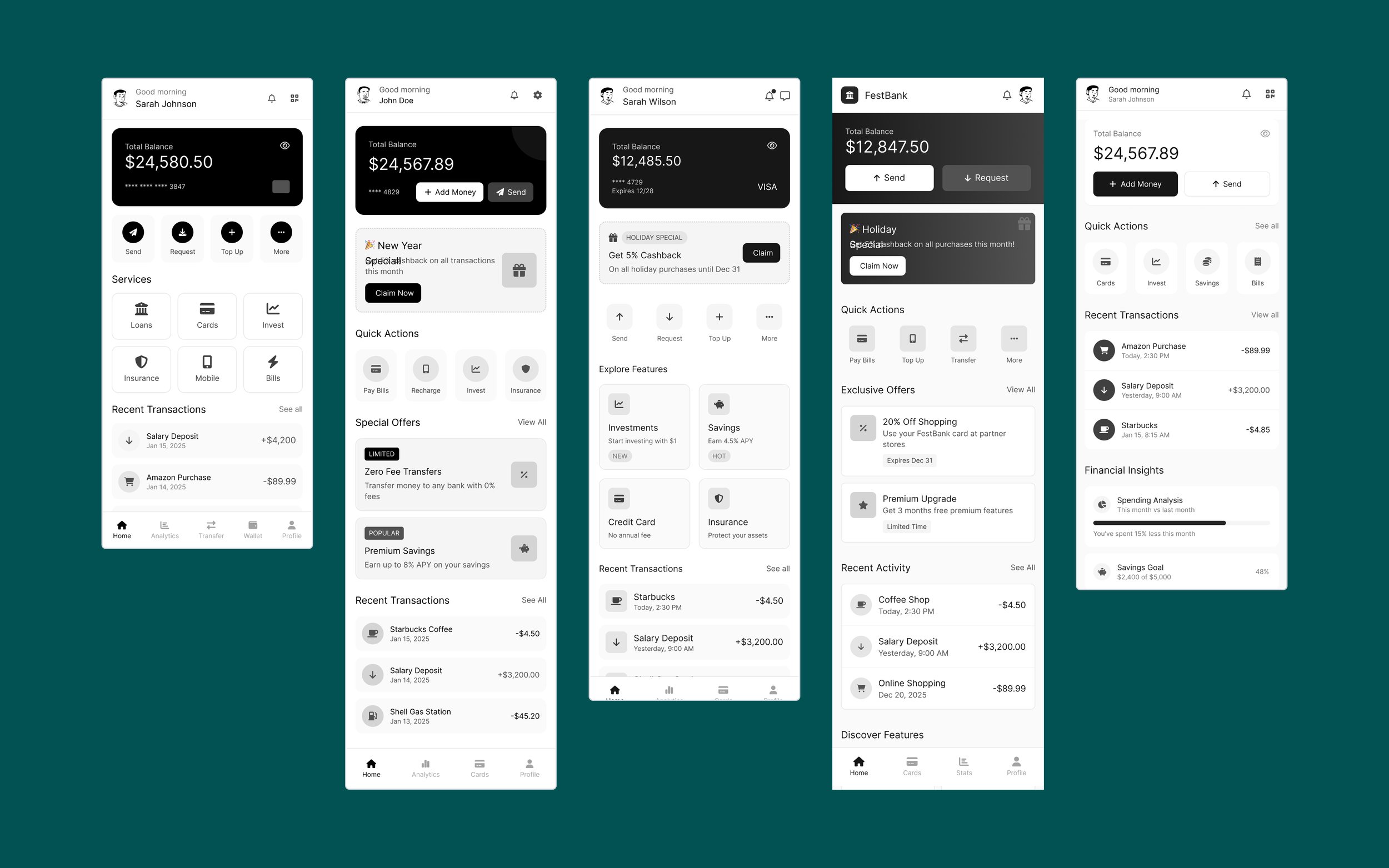
Layout test and exploration using Figma Make
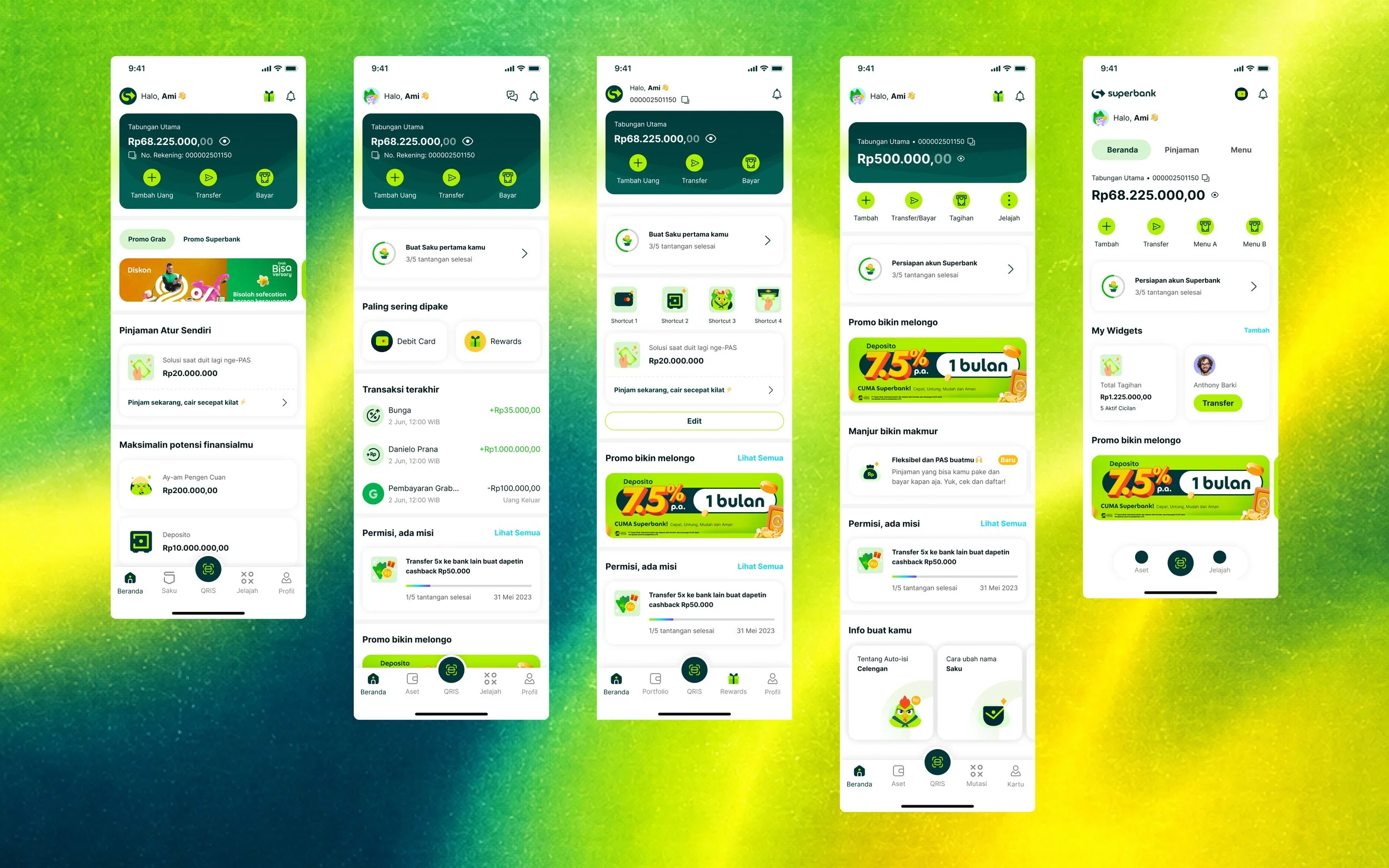
Early stages of explore each sections and functions for business and product usages
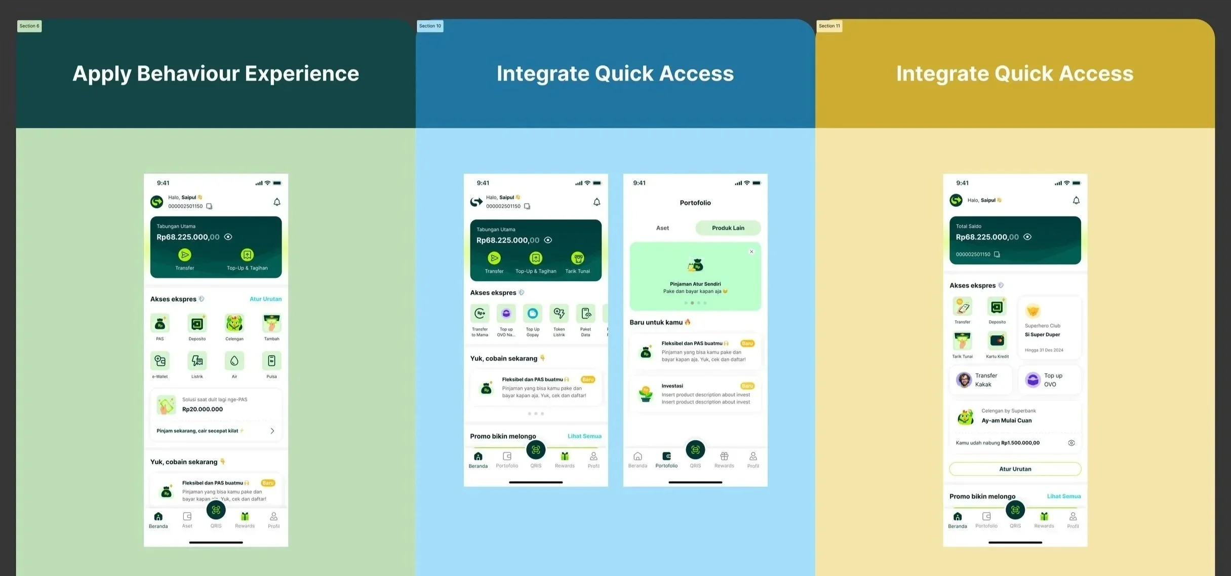
Continue explorations in customisation implementation in layouts and spaces
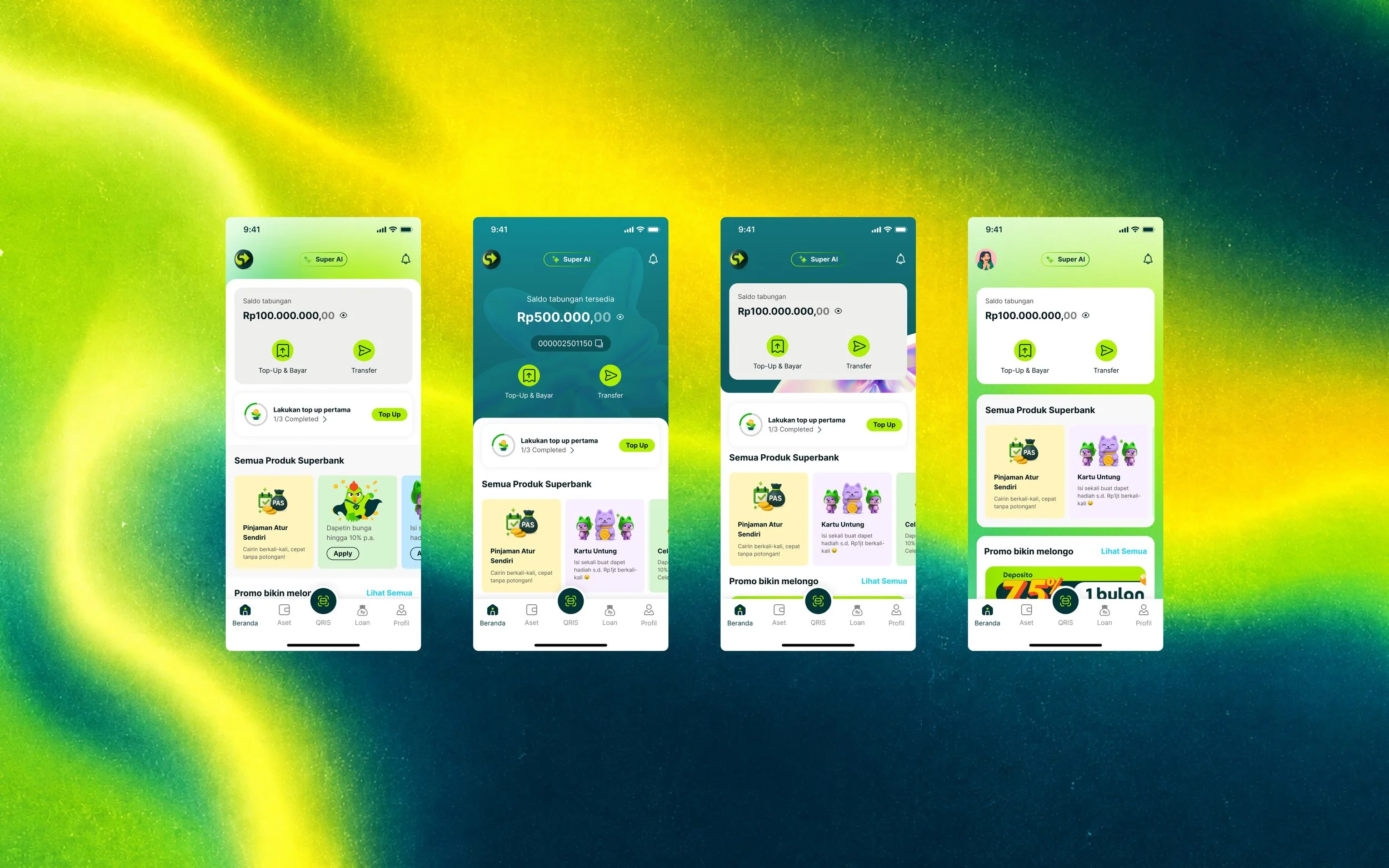
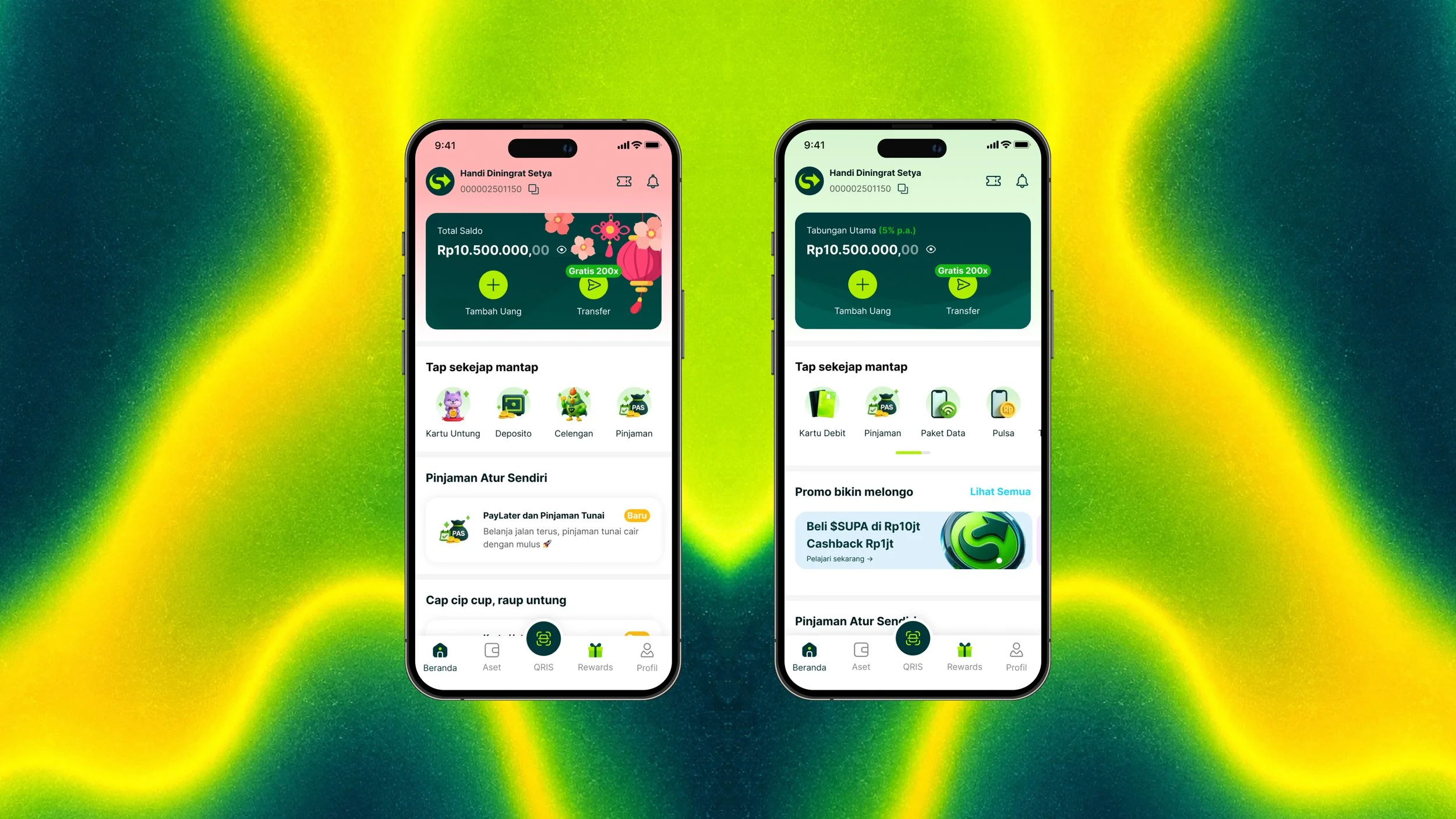
Exploring new skin variation as an initiative for future proof using 3D illustrations and more pop colours
The pivot: from a homescreen users configure to a homescreen that configures itself
Through the explorations, we'd been pushing hard on user customization — letting people freely set what they wanted to see, since research told us they longed for that control. Then a stakeholder asked the question that changed the project: "Having users manually set everything sounds tedious. Can't it just show automatically instead?"
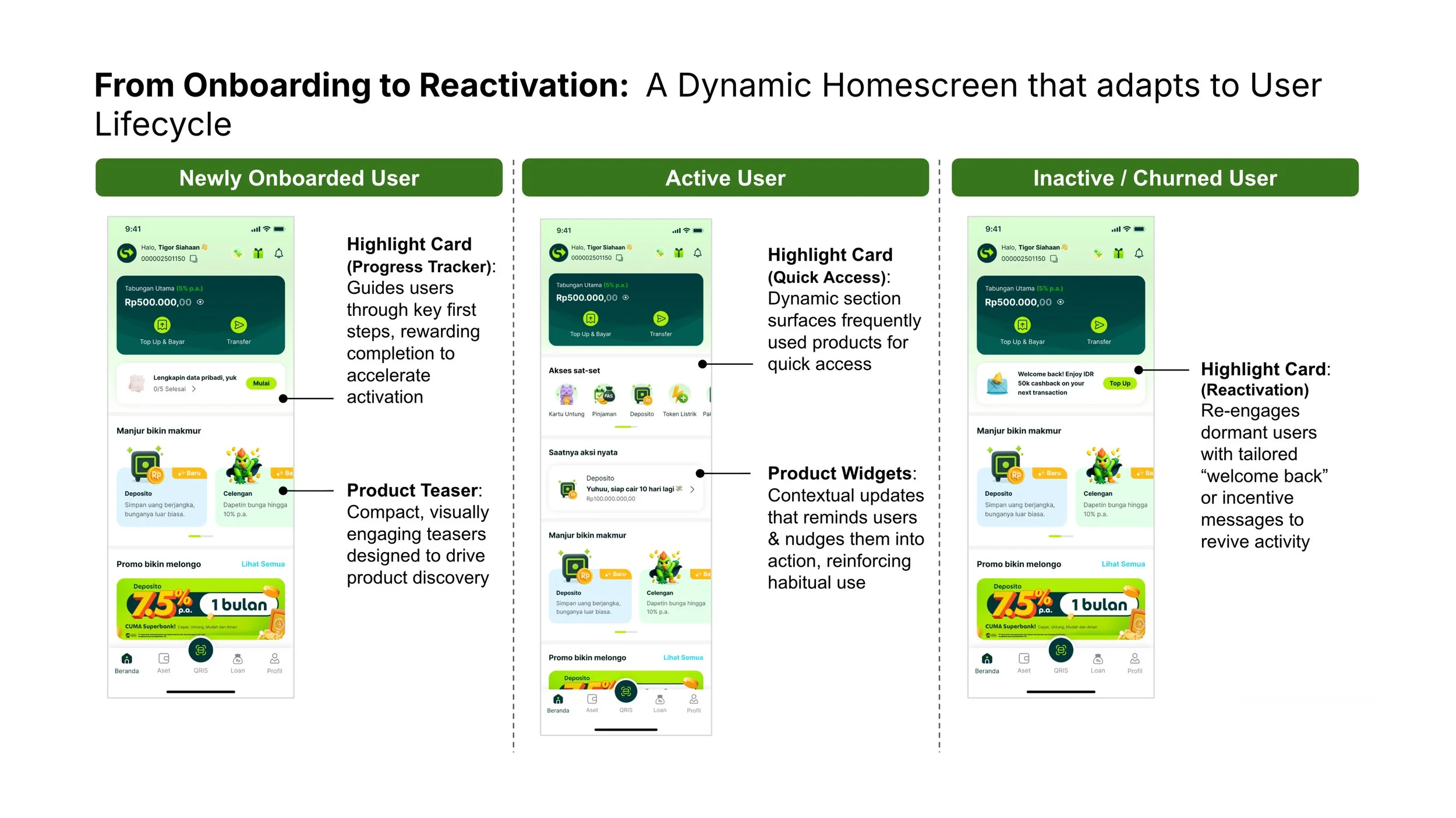
That's when it clicked. Personalization didn't have to be a menu users manage — elements could hide and appear on their own, exactly when they were needed. We had been trying to design something fixed. The real answer was to design something that lives: a homescreen that constantly adapts to each user's stage and situation.
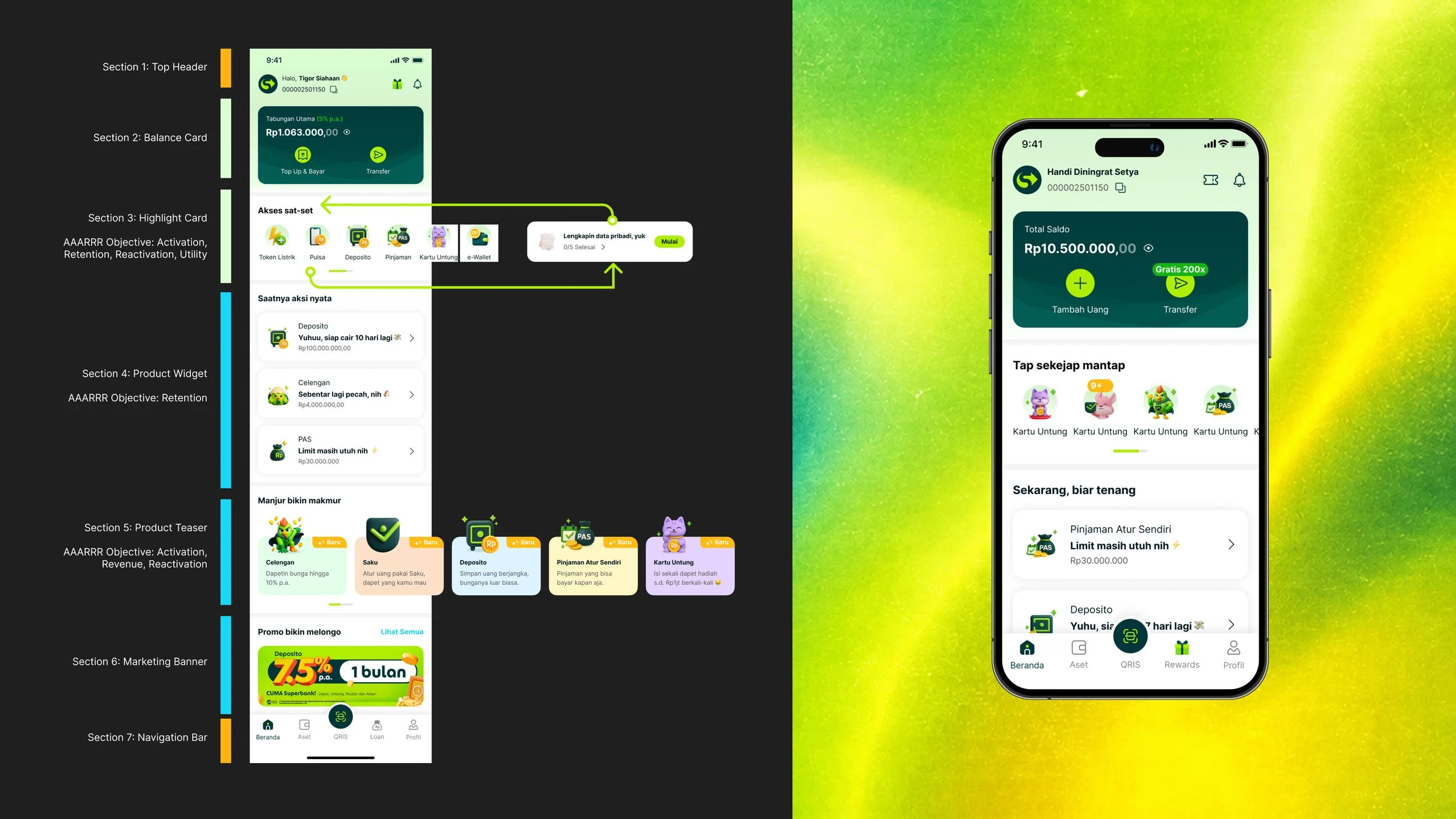
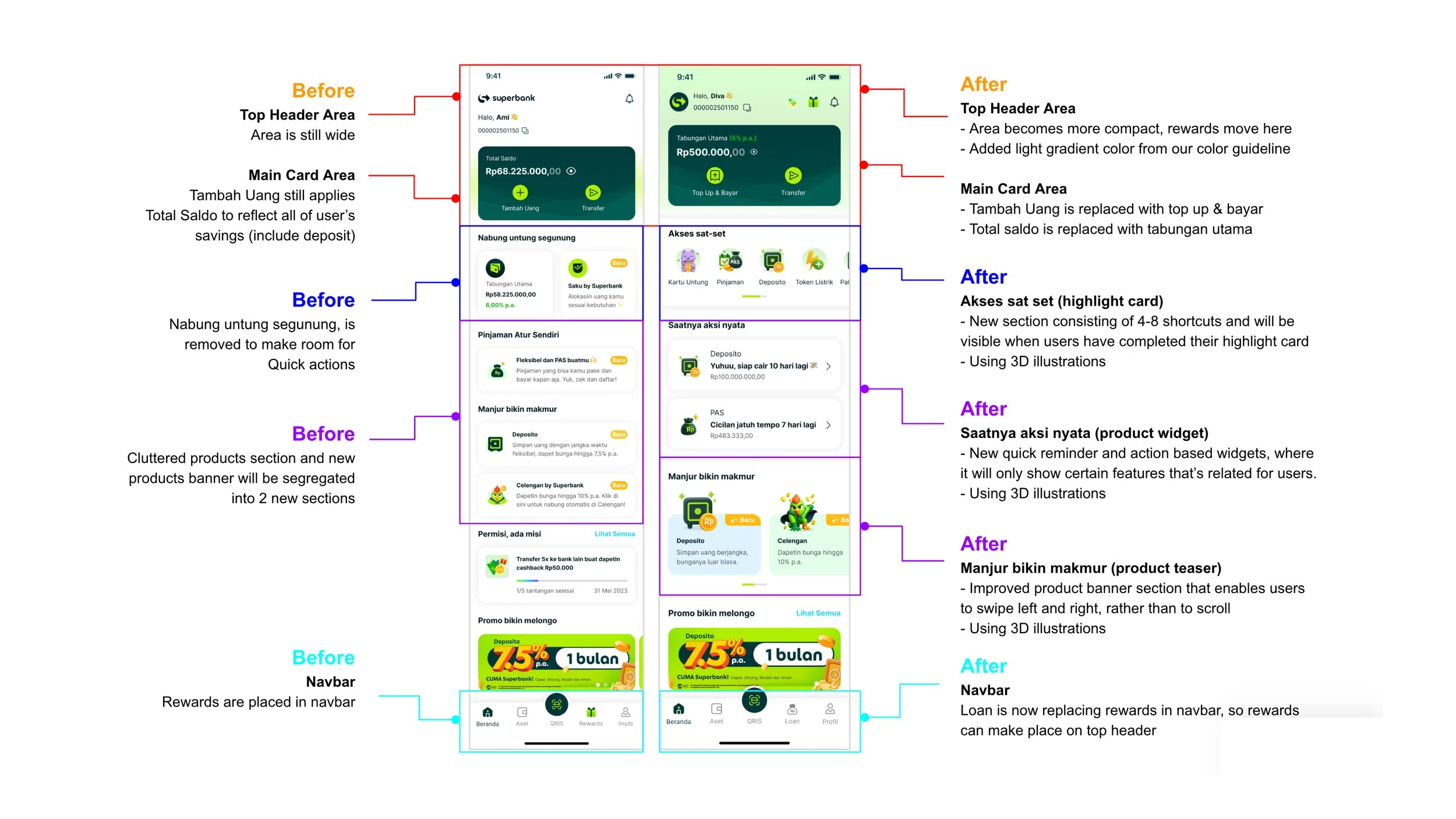
Anatomy of Superbank Homescreen design
Final output: a living homescreen, governed by three sections
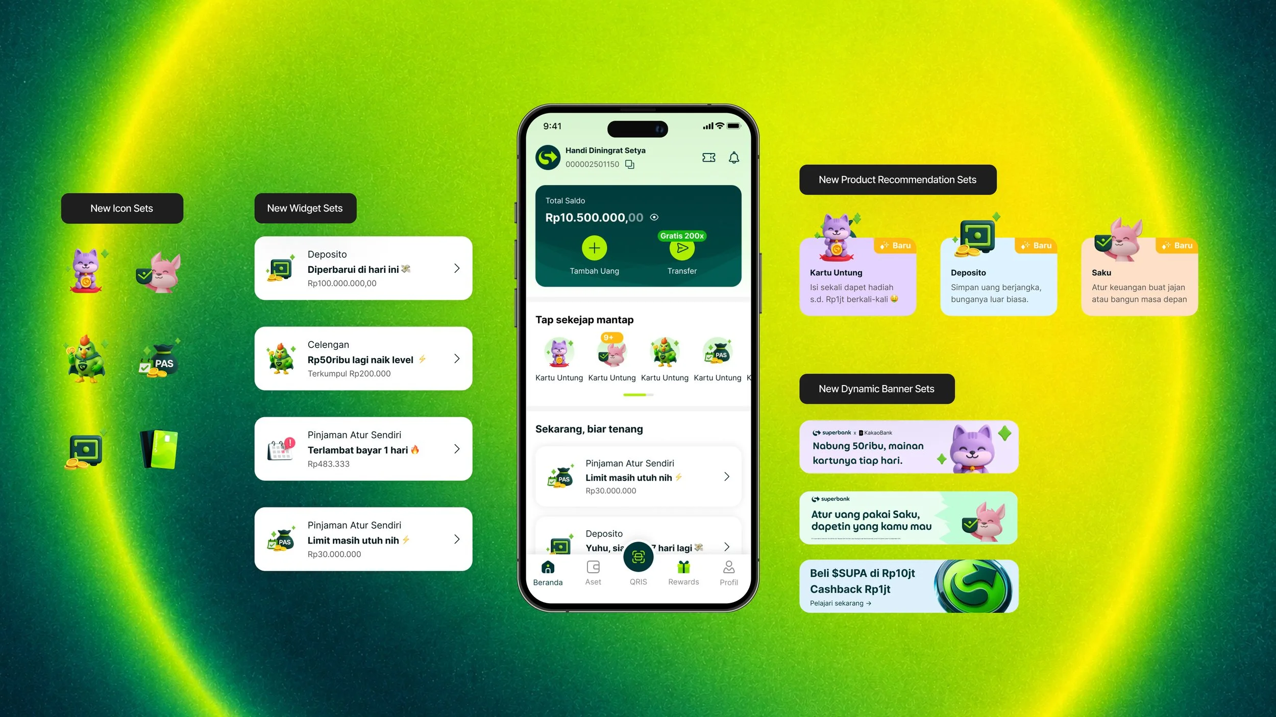
Placement was no longer a negotiation between PMs. It was a system. With AI automation and personalization direction set, we applied it to the governance model, introducing three section types, each with clear rules:
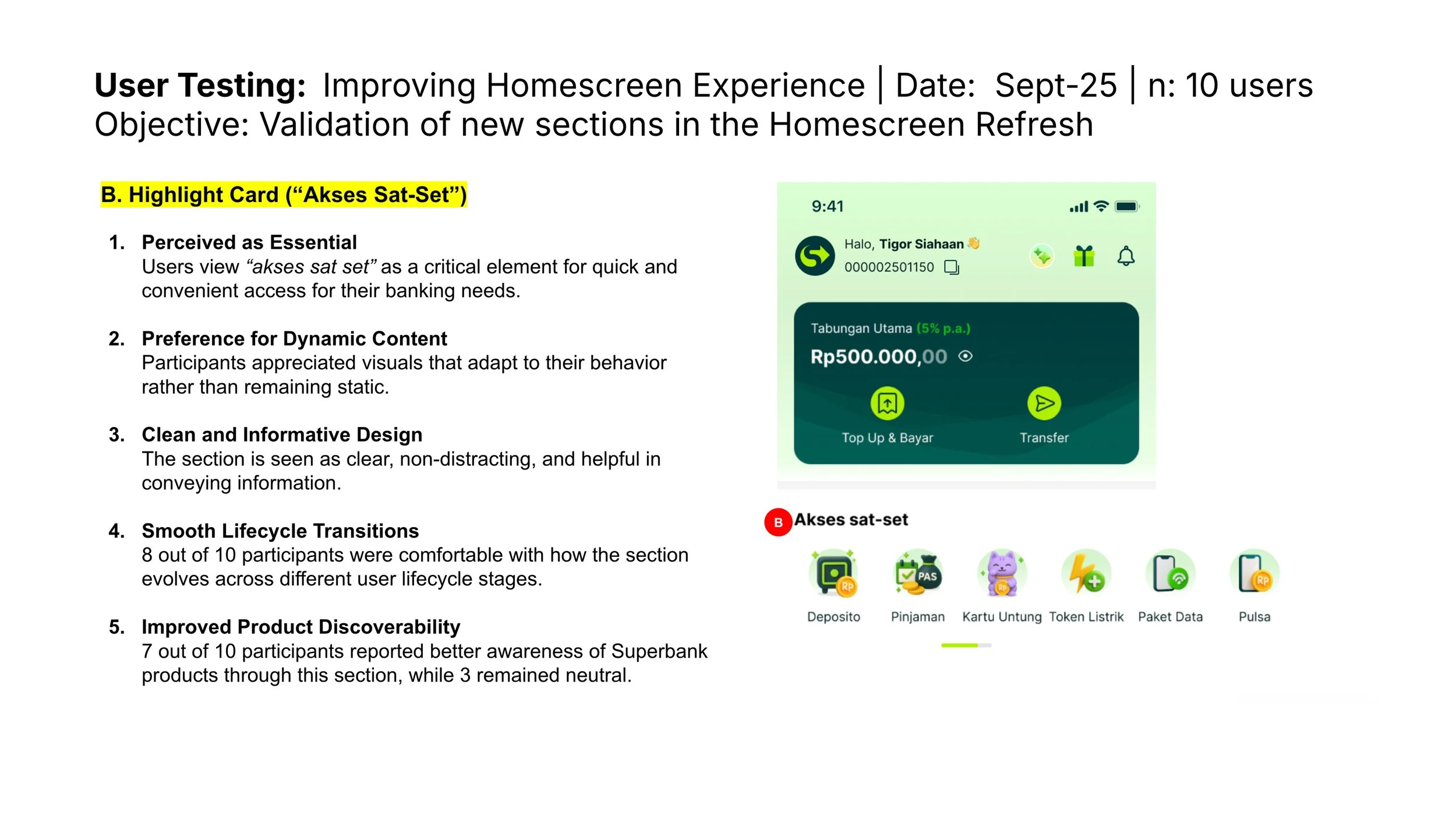
Shortcuts — quick navigation surfacing the products most suitable for each individual user.
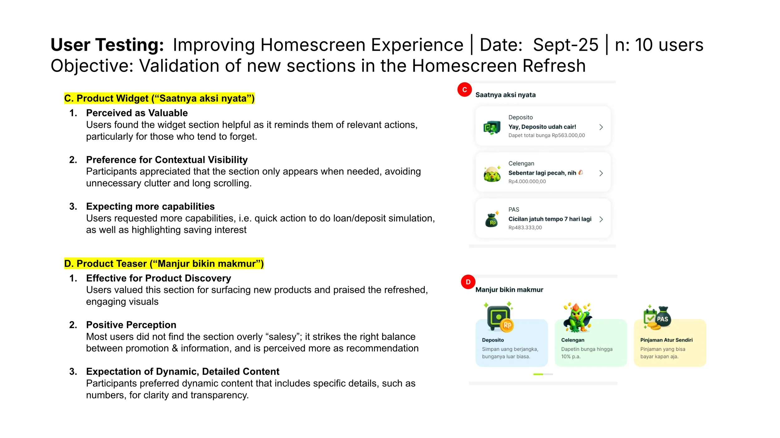
Widgets — components that appear and disappear on their own, showing up only as reminders and next-action steps.
Dynamic banners — promotional space that reprioritizes itself based on each user's case and need.
Impact & Outcome
First launch improvement: Phase 1 by the numbers
+40% click-through rate since the new Shortcut section launched.
+20% daily logins, as users engage more now that products are visible.
Drop-off fell from 22.57% to 10% — cut by more than half, with far fewer users logging in only to bounce.
Testing: Earning the buy-in with real users
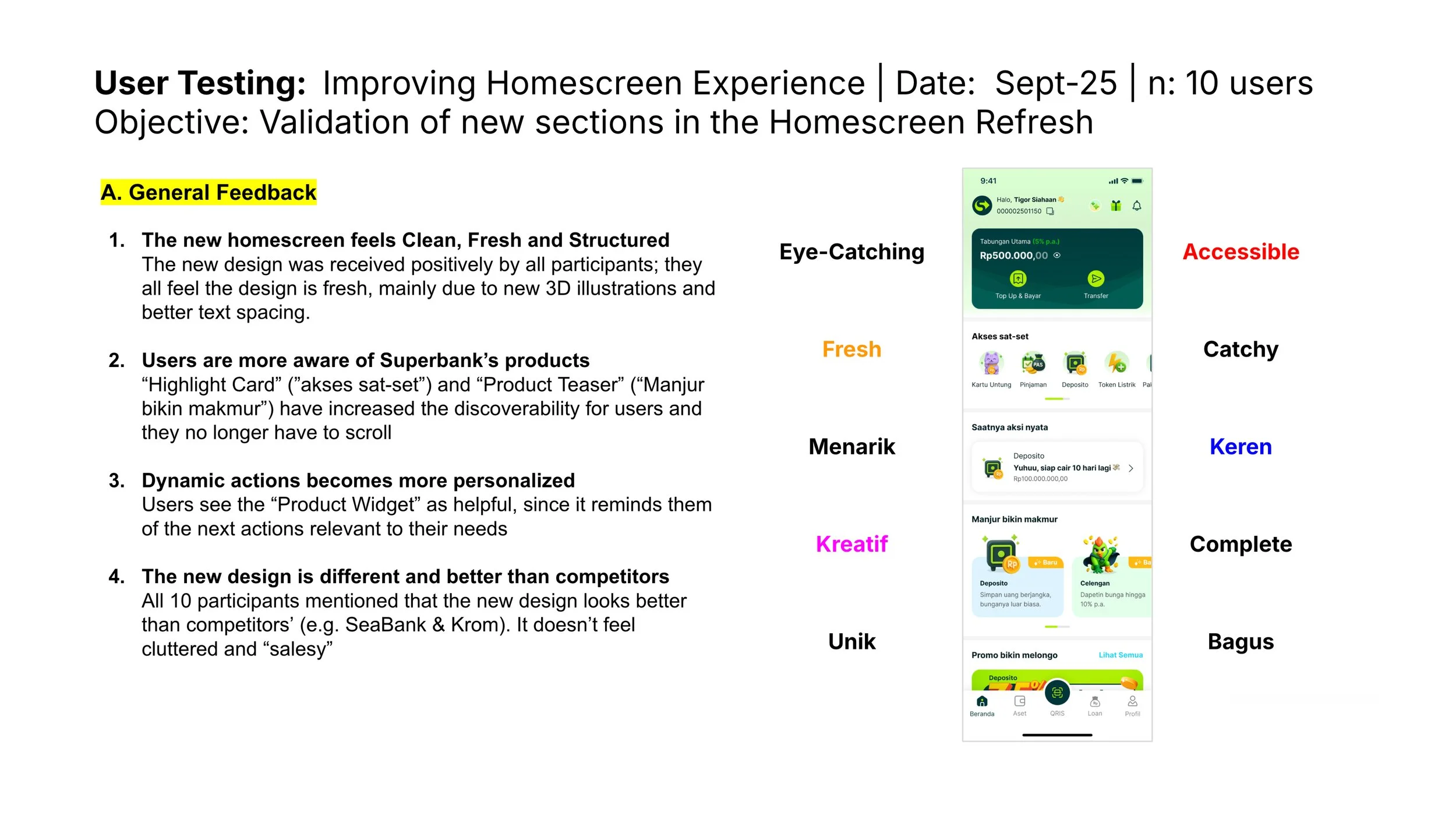
With the design finalized and the governance clear, we ran quick usability testing with current users. The feedback exceeded expectations. Users called it smart and fresh, and said it actually helped sort things out for them. They also confirmed our original diagnosis: the old homescreen had forced endless scrolling to find the latest products, and users often had no idea what products even existed. Every section we tested communicated its purpose clearly, and people genuinely enjoyed engaging with them. Backed by data and strong user evidence, stakeholders gave the green light for development.
User response: From "I can't locate it" to "everything is personalised for me"
Usability testing validated the direction before a single line of code shipped. Users described the new homescreen as smart, fresh, and genuinely helpful, with each section communicating clearly and inviting interaction. The core complaint of the old experience — scroll endlessly, find nothing — was gone.
Stakeholder response governance, agreed and adopted
The homescreen governance became the impact that outlasted the pixels. Business and product teams now have a framework for deciding where a product belongs, and stakeholders agreed to adopt it as the standing governance for every future product and business placement decision. The battleground finally has rules.
Next Step: Shipping in phases
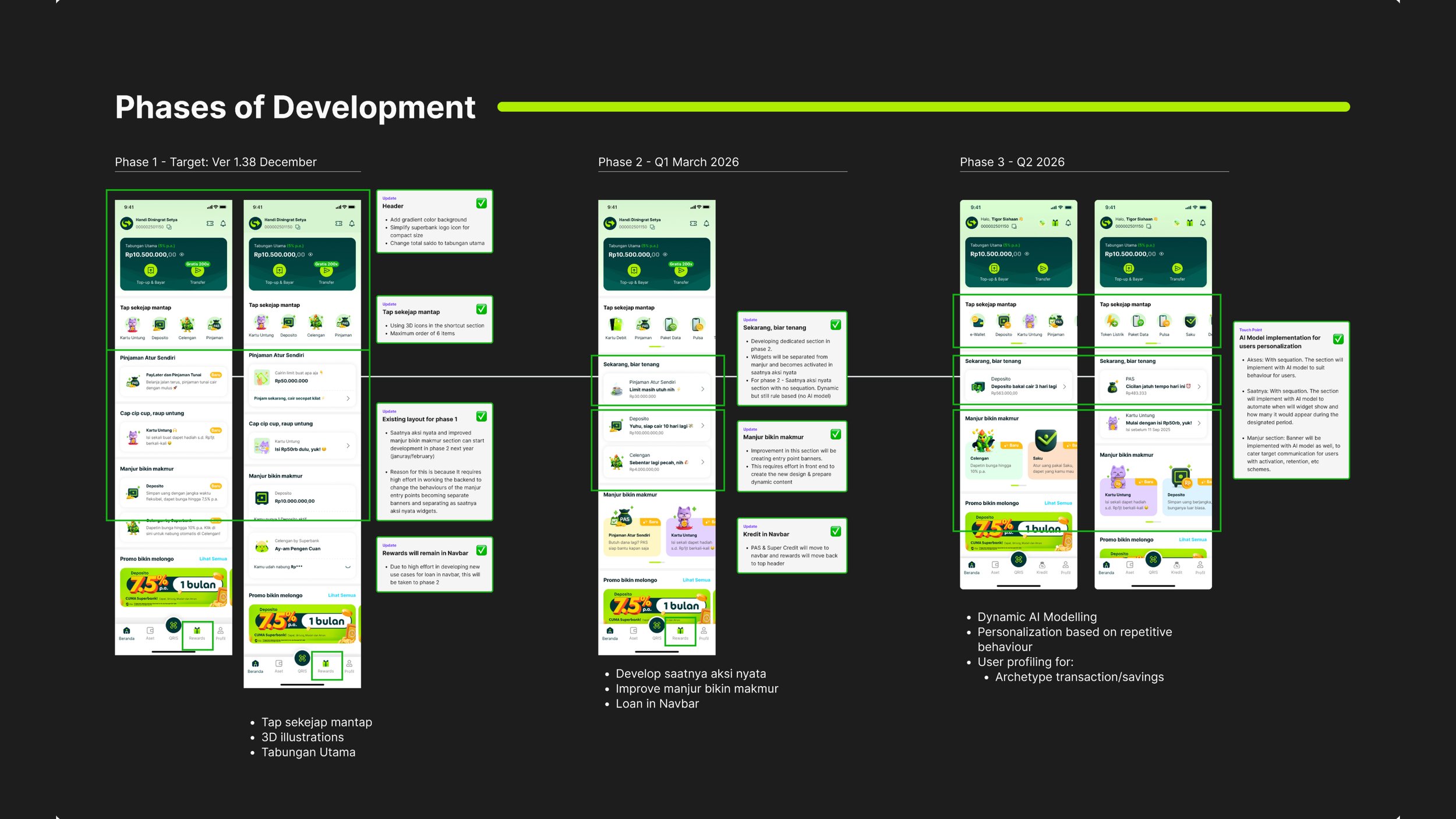
Whle phase 1 has been launched and tested, we are still maintaining and oversee the progress of engagement in the feature along the way. While this occur, phase 2 is already in development focusing on widget and dynamic banner.
While 2026 is the focus for phase 2; Next year phase 3 will commence where the focus of integrating AI automation for dynamic personalization will take place for testing and deployment.
We aligned on a phased shipment plan to de-risk delivery:
Phase 1: Above-the-fold focus: introduce the Shortcut section and roll out the rebrand with new 3D icon illustrations.
Phase 2: Widgets and the dynamic banner section.
Phase 3: Full AI automation codename dynamic personalization, making the home experience fully interactive and adaptive.
What this project taught me
This project made me a far better reader of data. I learned how much data actually matters in building impact where it was data that unified two seemingly separate problems into one, data that survived every stakeholder rejection, and data that ultimately won approval.
What I'd do better next time: streamline communication between product and stakeholders consistently and lock the north star from day one. At one point, the timeline slipped because the explorations became directionless. We were iterating without agreement on what we were iterating toward. Naming the north star at the very start would have cut the number of explorations dramatically.